Friday 31 March 2017

Welcome Back Watercolours | Raven and Starfire

In my many years of art, I have every now and then put down the pencils and pens and turned to paint itself. Most commonly I have worked with acrylic and watercolour paints. I liked both, but painting had never been something I was particularly gifted with, mostly due to the issue of having less control over my work.

I do have some samples of watercolour or acrylic pieces years old that I can show but for now I'm going to show you something very recent.

I went searching around my house and found an art briefcase, I used to love these things and as luck would have it, I found one with a selection of watercolours to use (although they had not been used for five years). After such a long rest, they came out of retirement and I was determined to improve my ability to control paint. Watercolour was the worst to control and wasn't particularly good for a saturated colour, I'm most probably doing something wrong. But with that in mind, I took the risk of using them again and made this picture of my favourite DC Comics heroines.


Starfire was actually created using mostly watercolour pencils, which I intend to get more of and love very much. They were also old ones that I was able to find and sadly lacked a shade of green (yet I still had the white one!) So with the exception of her metallic armour and green, Starfire was given more control because the colour was already applied.

As for Raven, I had the option to do the same by mixing three pencils together, but I only did that to mark the light on her presumably latex clothing. This was because I wanted to try using watercolour without the aid of a pencil on a larger scale than to shade Starfire's eyes. Unfortunatley this is where the lack of saturation comes through but I was still impressed with the result.

After the watercolours had dried, I brought out the felt pens to make the metallic parts shine and colour in the smaller details that my watercolour skill wouldn't have had a hope to try.

After doing this, I can see I'm clearly missing out. I've always been trying to get more and better materials, but to try new methods isn't something I always consider. This is one though that I will come back to again, I certainly want to master this technique and with a new set of watercolour pencils and watercolour palettes, things will only come out looking better with much hope!

Saturday 25 March 2017

Never Mind - Doctor Who Competition Entries

At the start of the year, a competition was held regarding their upcoming book 'Illustrated Adventures'. Entrants would be allowed to submit as many entries as they liked but only one per competitor would be chosen, if you were lucky enough to win.

I had the intention of creating four entries, two based on the episodes of the previous millennium and two from the current run of the show. However time was an issue since I had less than a month to complete these pieces, so I cut it down to the two I was most certain on. So my entries were as follows.

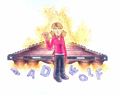
'Bad Wolf/Parting Of The Ways'

This is a multimedia piece made from fineliners and pencil. You'll notice I have used coloured fineliners to outline this piece instead of black (with the exception or parts of the dalek saucer. I knew from the beginning I wanted to capture Rose Tyler destroying the saucers and later on decided to add the Bad Wolf lettering that she scatters across time and space. The coloured outlines allow each section of this peice to stand out against the rest, such as Rose's outline being red and the explosions containing fragments of orange outline.

'The Angels Take Manhattan'

This peice I also knew from the beginning what I wanted to do. This piece took a more stylized approach and did break a minor rule, I added an extra gravestone but you can see my reasons for making this decision and through using silhouettes this makes it easier to signify that two beloved characters have died. This is what I'd say to be the best moment about series 7, a most satisfactory ending to one of my favorite TARDIS teams. I chose to integrate Manhattan into my piece by actually drawing above the lettering, the graves growing out from the title where the situation captured from the episode take place.

My favourite thing about this piece is not within the choice to use silhouettes, not the idea to build this scene on top of Manhattan itself but a very minor detail in River Song and the Weeping Angel. If you take a look at The Doctor, he is crying as he mourns over Amy and Rory, with his eyes closed. Meanwhile River Song, despite the loss of her parents and the heartbreak of her husband continues to stare at the weeping angel, so that they themselves can survive. That's what makes this such a powerful scene for me, and thus inspired me to recreate this moment for the competition.

Unfortunately, I have not won the competition, hence my posting the entries. We'd have found out last month if we had won, and if anyone had not claimed their prize, other winners would be informed this month.

But regardless of my loss in the competition, I enjoyed making both of these and having a bit of an experiment. I say congratulations to all of those who have had the fortune to win this competition, I hope you had as much fun or more when working towards the prize. And if you didn't win like myself, I applaud you Whovians for giving it a shot, don't turn down a chance of an art competition, it's always worth making an entry.

Friday 24 March 2017

J'ba Fofi [Character Mashup Designs | Spiderman meets Tarzan]

I recently watched Tarzan, without a doubt my favourite Disney film of all time and watching him swing on his vines reminded me of Spiderman. That is genuinely all it took to get me to do this. I was intent on creating a character design which combined the elements of these two legends.


One thing I was certain on was J'ba Fofi having a mask, as not just Spiderman but most superheroes would. This mask is inspired by the many variants of jungle masks as I wanted this character to belong in the jungle, very much like Tarzan. This explains the chosen name, J'ba Fofi being a spider from the African jungles.

My only concern is his costume. I considered him having the spider emblem painted onto him but I felt that this didn't look primitive enough for the design and so to prevent him from looking too much like Tarzan, I gave him a cloth that covers half of his chest as well.

I didn't get around to colouring him, maybe I'll do this again in the future and give J'ba Fofi the finish he deserves. If anyone is interested, he was going to have a colour scheme of brown and yellow. Let's hope he returns in the future so he can be made official.

Monday 20 March 2017

The Alphabet Challenge | F

F is for great uncle Ford


While my previous entry to this challenge saw us plunge into new depths with a digital composition, this one sees us return to the traditional coloured pencils. It's been too long since one of these was done in pencil and Stanford Pines, also known as simply Ford was the suitable candidate for this medium.

I love Gravity Falls, as I'm sure many cartoon lovers will. But the only main character I had not drawn yet was this guy. I believe I have done him justice and really enjoyed using the pencils to create his stubble texture. I found a pose that I loved from 'Mabel And The Last Unicorn' which I just had to replicate, but the pose was all I replicated as in the original scene, Ford is just over thirty years younger and wearing a different attire.

Lastly I couldn't resist adding Bill Chipher in the back, something for Ford to run away from. I understand it may look like he's dancing on Ford's arm but I can assure you Bill is just further back, I should've thought about that before inking Bill into the piece.

Have you seen the letter E? If not you can check it out via my page for the 'Alphabet Challenge' as well as all previous entries. Look out for G coming soon!

Saturday 18 March 2017

Personification | Colours

Some time ago I felt like personifying the colours. I know this is something people do a lot but that's because it can be a fun experience. I only have two colours to present though and so first is White.


White is commonly connotated as innocence and purity so I naturally created a character which would come across as such. The most creative decision in this design would be the hair, which is actually shaped like the letter W both on the front and back.

I gave her the grey eyes because grey as a genuine eye colour and I wanted her design to be monochromatic, despite the use of blue for blushing.

The other colour I personified is red.


Again, the hair was inspired the same way and so you'll notice the R shape forming on the top of his head. It's difficult to tell but I've given him a rather bulky build, which at the moment is covered up by a sleeveless jacket.

I included the flame design on his jacket and spikes on his shoes to add some aggression to his design, as well as sharp eyebrows. He also has a rather squared jaw and a six-pack to add some masculinity to his body.

Not much I know but I've had a lot to do lately, expect more content as scheduled soon!

Friday 17 March 2017

Moving Vehicle Challenge | Hurricane!

I'll keep it simple, the only reason I did this challenge is because of what that title describes. I was taking a train but unlucky me had to have his train tickets booked for the same day Hurricane Dorris would be arriving at platform UK. As a result, I was rerouted on every leg of my journey and even delayed. And so we're here:


Don't worry, I didn't touch this paper unless the train was moving, I'm not cheating. You'll notice I'm using lined paper this time, and that's because I was using my memo book instead of a sketchbook, because that was what I had handy on the train. I started off by drawing in pencil, which is the train above. I couldn't help but draw a train while I was on the train. After coming to terms with how I'd be drawing, I moved on to the piece below.

Yes, Droey is wearing the attire of Sir Topham Hatt [The Fat Controller]. I drew him in pencil first and then went over the line work in pen. This came out better than I expected, but then again the rails of a train are smoother than the roads and perhaps if I do this again I should move on to the hard mode, we'll see.

Saturday 11 March 2017

Scene Recreation | Split Personality

I'm sure there's fans of Phineas and Ferb out there. And you'll have probably worked out what this is. Do you remember that episode when Phineas and Ferb build a molecular separator and Candace ends up being splitted into her Jeremy loving side and her Busting side? Well here's my favourite moment from that episode!


Recreating scenes is something I'd love to do and should do more, and maybe add some backgrounds as well. But regardless this was a wonderful amount of fun to recreate. I kept struggling to decide just which of these three I felt was drawn best. Although it is weird to have drawn Candace without her neck, maybe if she is drawn in the Drawson style again I'll give her the neck back.

You may notice as well that unlike most of my pieces, the lines are varying in width. I wanted to do this because I've heard from artists that varying your line widths can make your piece more interesting. My style will always be to keep lines at the same consistency but I do love this method and it certainly did make this more interesting. In particular, this is the case with Candace where all of her most tense features have thicker lines.

Are there any scenes or characters you'd like to see recreated in the Drawson style or just in general? If so, be sure to let me know in the comments!

Friday 10 March 2017

OC : Drobot

After watching some videos about a good Nickeloden classic [My Life As A Teenage Robot] I was just tempted to roboticize myself. No this is not Droey Drawson, but his robotic counterpart 'Drobot'.


I did have a few head shapes in mind as I designed this mechanical masterpiece.  The first design was the standard circular head with the Drawson Star printed onto his forehead. The second design was influenced by the mecha from Gurren Lagann (specifically Lagann) and so was given the Lagann chin and what you now see acting as the light piece on the hat. However this design was bottom heavy and so on my third design I tried something top heavy, which actually lead to the official design, a cylindrical hat with visor eyes.

Replacing the beard is three little lights, and the moustache is a mechanical plate. The legs were heavily inspired by that of Jenny Wakeman's (XJ9) and the rest was to my own imagination.

I was considering adding jets on the back that would be built to watch the shape created by Droey Drawson's hair but as you can see that has been removed from the official design. Though that's not to say you'll never see him wearing that attachment!

Would you be interested in seeing more roboticized or even humanised OC's? If so let me know and who you've like to see transformed in the comments!

Monday 6 March 2017

The Alphabet Challenge | E

E is for Eve


No second thoughts, nobody else considered, I was set on giving this fictional character some attention. I discovered Eve a couple of years back and was instantly hooked onto it, having now seen all of the first two seasons... I've got some catching up to do!

I love a bit of science fiction. It's always been there in my life, be it a police box or mutated ninjas or the less memorable but still wonderful at the time Lunar Jim. Eve was a breath of fresh air for me since I had not seen any sci-fi dramas recently, particularly those aimed the youth. The very concept of Eve herself is brilliant and so for the letter E who better could I think of?

Those of you who already know Eve may be aware that she can separate parts of her body at her own will, or at least just the hands anyway. So this gave me the opportunity to draw someone with detached parts for probably the first time. Eve is usually curious and cautious but I wanted to capture the happier side of her and so gave her Poppy's brilliantly roboticized smile and made her wave with the detached hand in her other hand.

And of course, yes! For the first time you are seeing some of my digital art! This is not the first time I've used Photoshop, it's actually the second. You'll see my first Photoshop piece some time soon. I'm trying to balance out my methods but I ought to inform you early on that they will all be colour pieces and so I'll do what I can to make them as experimental as possible. I'm considering learning the art of water-colours again so if I get a grasp on those, look forward to that some time.

Have you seen the letter D? If not you can check it out via my page for the 'Alphabet Challenge' as well as all previous entries. Look out for F coming soon!

Saturday 4 March 2017

John Esposito - An OC made out of Pizza?

You've read me right, this OC was made out of a pizza. Here my explanation for this.

After doing a bit of housework the family decided to order a pizza, who doesn't want to eat a takeaway pizza? So I did this sketchy drawing of Droey Drawson, Anne and Tenvad engaging in a small pizza party with another OC, at the time just a body with no identity.

Initially I was going along with the idea of a takeaway delivery guy, which I reckon he still would be but I just became more interested in just making as many links in his design to pizzas as possible. For example, rather than give him the average round head I've shaped it as a rounded triangle with a beard where you'd find a pizza crust. And the spot pattern on his jacket for pepperoni of course.


Another thing to add is that before deciding what colours to give him, I tried one of the colour theory tests. Probably my favourite method, and still the only one to date I have learnt, is the method where you take an image and select colours found from it. The picture I took was of a slice of pizza and the only colour on this design not from that slice is the green which I used to contrast the rest of the colours.

Also I gave John some chinos and a polo shirt. I've never drawn chinos before, would you believe that?

Do you think I should make more food based OC's? If you then add some suggestions in the comments and I'll see what I can do!

Friday 3 March 2017

Touch The Rainbow, Taste The Rainbow!

Spring is here, yay!


Recently I started using Pinterest as a means of looking for inspiration, and it is because of this particular image below that I made the piece I'm sharing with you today.

Image from Pinterest, not my own work

While as a traditional artist, I don't have the supplies and means to create something quite like this (as much as I would love to) this image made me want to do something with a rainbow effect. I don't recall ever actually doing anything like this before, unless drawing a rainbow itself, so this was going to be a first for me.

As to what I would create, I was stumped. I didn't want to do anything too similar to Mabel and her flowing hair because it wouldn't feel like I was creating anything but just copying. And then on the TV came an advert that while one of my family may not particular like, it amuses the rest of us very much.

Skittles at the moment are broadcasting an advert where someone of the Rasta culture was milking a giraffe eating from a rainbow cloud. I shan't say anymore but instead let you see for yourself in case you haven't seen it. 

Please note that I am by no means advertising Skittles, I'm going to honest and claim I have never eaten a Skittles or intend to.


Having seen this, it came to me. I chose to create a giraffe constructed solely of colours from the rainbow. I left their skin's natural yellow tone and used the rest of the colours to create the eyes, hair, spots and hooves.


I did not use any pencil prior to colouring this but went straight into using coloured pencils for the best possible outcome. My only regret is that I didn't leave any room for green spots, but luckily the hooves needed to be a different colour from yellow. Overall I love this very much and it was a nice bit of fun to create this, especially considering I've never tried to realistically draw a giraffe before.