Saturday, 28 September 2019

I'm Going To Eat Some Biscuits!

Today beholds a two panel comic strip featuring two characters you won't have seen since February's YouTube video. Here's a rather comedic introduction to the engaged couple Kaboom-beat Sketch and Lissy.


This was just a funny sketch I had to put together, and a good way to bring back Kaboom-Beat and Lissy. These two are a lovely couple who are very close to each other. Kaboom-Beat has unfortunately broken one of his collectible Transformers and so has resorted to cheering himself up with digestive biscuits.

I was prompted to do this with the quote 'I'm going to eat some biscuits' and was required to include Kaboom-Beat in this strip, so it made sense to include his partner, Lissie. I went with my flat coloured pencil style of colouring since I didn't have much free time to work on this comic strip, this explains the simplicity of the purple background as well.

That's all I have to say about today's piece, but we're gonna be seeing to in light of October's arrival we'll be seeing the return of one of the Sbookies on Wednesday! Which of the thirty one spooky creatures will it be? Come back next Wednesday to find out!

Wednesday, 25 September 2019

That Time Jazza Trusted Us With Photoshop | PART THREE

Ages ago Jazza set up an art challenge for us to Photoshop him in whatever way we pleased in order to roast him. I took this opportunity at the time but never shared the work I had done! So after over a year in hiding here is one of three pieces that I created.


Out of the three I created, this is the obvious favourite and a perfect choice for a grand finale to this trilogy!

You may notice, I actually gave time and effort to this piece, but I also used every single Jazza that we were provided with! The stage background was sampled from Google Images and was a perfect set up for my intention, a performance of Jazzas with no control!

I think it took about an hour to decide where each Jazza would be placed though for some of them it such as the airborne Jazzas it was pretty easy. I knew I wanted the screaming Jazza to be center stage and that the Jazzas which were cut at the hips would have to be scattered among the seats. As each Jazza was applied it was becoming easier to see which Jazzas would go where and who they would interact with.

Effects were applied not to just the Jazzas but the piece overall, after I knew where each Jazza was going. I was using effects such as gradient overlays, satin and the inner glows. The colours I would use to apply these effects were golds and browns so that everything would blend with the background stage; in hindsight it was like a long version of using the colour balance tool.

Looking back on these, it resembles one of the those renaissance paintings where it's hard to tell what is happening, but brought into a modern light. I remember having tremendous fun creating this and it is still a delight to look back on, one of my finest Photoshop jobs to date! Have you ever played around with Photoshop to see what kind of crazy art you can make? It doesn't have to be for silly edited images, you can create all kinds of art with it or any digital program with artistic tools. To those who have stuck around to see all three of these Jazza Photoshops, I bid you my congratulations for surviving the weirdness!

Wednesday, 18 September 2019

May The Force Be With Foxy

This is Foxy Archi, some of you may have noticed her in the YouTube video from March, about Droey's Spidersona. There's not much you know about her, but I can tell you she knows how the wield a light-saber!


Foxy recently started training with a light-saber and has proven to be an excellent warrior, crossing her is a dangerous idea. However it has become apparent that she is learning the ways of the dark side as the light-saber's crystal has started bleeding, lets hope that purple doesn't turn to red!

I did this illustration using my Ohuhu markers, a black brush pen and my white pen. Firstly I coloured the illustration with the Ohuhu markers, creating areas with purple highlights that would be both the lighting from the light-saber and the reflective lighting. I late went over both of these with the white pen to make the highlight effect more convincing, with the reflective lighting the white has faded enough to look like a weak purple highlight.

Along the bottom of the illustration I used the same dotted effect from the lightsaber lighting to add a gradient that gets lighter. Along the top I used my black brush marker to create light strokes that I would build up in smaller strokes closer to the top to crate a gradient that goes from the deep purple to black.

I have noticed that unfortunately the gradient lighting doesn't cover the entirety of the bottom and actually cuts short a couple of millimeters before the character, which is quite off-putting! Other than that I am very happy with how this illustration has turned out and am looking forward to seeing what my next Ohuhu illustration turns out like. Be sure to come back next time for the conclusion of my trilogy focused on Photoshopping Jazza from Draw With Jazza!

Saturday, 14 September 2019

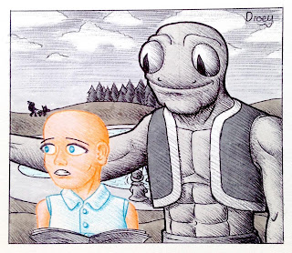
Gorf Meets Candy

Every year I make it tradition that I do an illustration with ball point pens about a giant frog man who has gained the name Gorf. But unlike the previous two, this illustration is not set after the horrendous murder he is believed to commit, but is set out in the open!


I was looking up some prompts and I found a quote along the lines of only seeing in grey until someone came in and they were a burst of colour. So I've decided to make it official that Gorf is colour blind. So I knew following this prompt I was going to go back in time to the day that Gorf and Candy first met, it was just a matter of deciding how they would meet. It was after looking through images of introductions that I was able to decide on Candy asking for directions, which despite not being perfectly clear in this image, is implied with my best efforts to be what is going on.

I don't think my ball point pen shading was as effective as it was the last time, but the previous illustration was intentionally darker while this one is set in natural daylight. Candy's shading is up to the standard I had wished to achieve and so are backgrounds elements such as the hills and the trees. Like the last time I used my Tombow pens to apply base colours to the illustration which has allowed for the variety of greys that is seen. But perhaps the most unique part of this piece compared to the previous two is how there is no red; no blood!

What do you think next year's Gorf and Candy piece will be like? Will I recreate an illustration or dive deeper into their story? Only time will tell, in the meantime why not try having fun with ball point pens yourself?

Wednesday, 11 September 2019

That Time Jazza Trusted Us With Photoshop | PART TWO

Ages ago Jazza set up an art challenge for us to Photoshop him in whatever way we pleased in order to roast him. I took this opportunity at the time but never shared the work I had done! So after over a year in hiding here is one of three pieces that I created.


'Circle Of Jazza'

A truly majestic abstraction of Jazza that many will look at and wonder what the heck I took to come up with this, but I can confirm I'm just insane! There was just one image of Jazza waiting to be mounted onto a mighty creature to ride, little did he know I was thinking of making Jazza ride another Jazza! It doesn't particularly help that Jazza is looking back to the previous Jazza and so forth!

The only two flaw with this start at the legs which meant I couldn't create a truly limitless loop, but the idea is still there. The second flaw is the ropes being held by Jazza, I haven't connected them all together, so there's breaks between every two Jazzas! If I were to go back to this piece I would add in the remaining robes to complete the circular link.

Much more Photoshopped than the first one, wouldn't you agree? Be sure to come back on the 25th September for the third and final edition to this trilogy, or just come back every Wednesday and Saturday for more artistic content!

Saturday, 7 September 2019

Love Is In The Air... And So Is Cheese

Is that John and Ida on a date? Well, John thinks of it as a date but Ida sees it as just a friends' outing that nobody else bothered to show up to. But just how many people would be interested in an entire museum dedicated to cheese? That's probably why it's not very big.


So creating a museum that is all about cheese, it was interesting. I was prompted both museum and cheese which is how this location has come into existence, but enjoyed filling up this scenery with mostly humorous ideas. The center of the piece was obviously going to be some actual cheese contained within a glass case so that the cheese couldn't be affected.

There are five other features in this illustration. From left to right, the first feature is the cow's head which is said to be the first cow milked in the area. Next there is a joke book written by Jerry Camembert, the most cheesiest jokes. Visible above the cheese there is a poster asserting that Droey Drawson is not allowed on the premises! What did he do to get a poster like this? Not far off there is a painting of the local cheese critic Wallace Fonda and lastly there is a bowl and some Fondue forks.

The colours for this piece were selected from a cheese platter image found on the internet, while the lineart is ballpoint pens. This is orange for the most part and red for the character so your attention is more likely to be drawn to them. Even though it looks like it, there is no blue in this illustration, that's actually a very desaturated Jade Green!

I loved creating this illustration but the colouring for this was the most interesting part and something I haven't done in a long time. Both John and Ida were coloured using specific colours from images when I created them so having an illustration of them coloured the same way feels like a nice continuation of their qualities. If you want to colour an image but are not sure how to colour it for greater appeal, you should give this method a try because it's bound to work well for you!

Wednesday, 4 September 2019

Costume Swap - Anne Natalie and Eliza Barnsley

Anne Natalie and Eliza Barnsley aren't too different from each other. While they never knew each other for most of their lives, they have met on a few occasions through their mutual friend, Droey. One day Anne suggested that they swap outfits and Eliza, though unsure at first gave in to the experiment.


Now when Eliza agreed to this, she was expecting the chance of try on one of Anne's many designs but it turned out she would be wearing her trademark towel! Anne on the other hand was rarely seen so covered up on a good day. They didn't put on each other's clothes but Anne had made them by studying the original outfits and redesigning them to fit each other. At the end of the day it amounts to Anne having a new trendy look that she might wear again and Eliza has a new bath towel.

Have you ever swapped clothes with someone, or swapped the costumes of your characters? It's a strange idea but not unheard of, see how strange the costume swaps can get!