Wednesday, 31 July 2019

It's Another Draw The Squad Prompt!

I know, I've been doing a few of these lately but they're so fun to do! I came across this one and had a new trio of characters that just fitted it so well that I couldn't resists making it.


Introducing from left to right, Pudding, Ariana Sketchbook and Taniya! These three teenagers are almost always together and are difficult to separate! Here's the original prompt drawing that this illustration is based on.


You can see where I have made subtle changes to fit the shapes of the characters as well as the personalities of the characters. Taniya's expression has been made more laid back and at ease rather than cocky and assertive. The proportions of these characters in the drawing are different to the proportions of Droey's Draws characters so everyone was moved closer together which despite making the piece feel crowded, is a good way to showing a closer bond between the trio.

Are you in a trio of friends that fit this prompt, or are there any prompts out there you want to try? It doesn't even have to be a Draw The Squad picture, anything around you is a prompt so have fun playing around!

Saturday, 27 July 2019

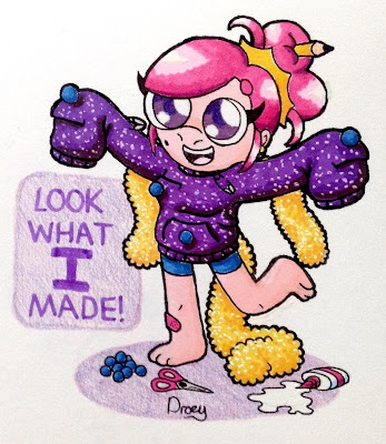
Look What Anne Made!

Remember that Anne Natalie designs fashion? Well here's a sparkling new creation of hers; even though it's summer she's made a sweater!


So I was just looking for something to draw and saw a picture of someone in love with their sweater, I drew it out and decided it would really suit Anne Natalie. Boy was I right, it really brought out the cute vibe that Anne was originally intended to portray and gave me an opportunity to work with her costume designing habits!

Anne's jumper started off as just a jumper with a couple of pockets and long sleeves. But then I took some suggestions for ways Anne could make her jumper more interesting. This led to the inclusion of safety pins, pom poms and a load of tinsel! What with all the D.I.Y. Anne was getting up to, it became necessary to add a pencil, some scissors and a bit of glue. I even decided to put a plaster on her right leg, maybe something went slightly wrong while she was making it?

The colouring for this piece was pretty experimental as well, I used my Ohuhu markers. The difference is this time I tried blending the markers and when blending any markers, I tend to get nervous. I looked to a DrawingWiffWaffles video for advice, in which she makes an art piece while blending with Ohuhu markers. I followed her method mostly, using the chisel tip where I could to blend the ink.

The leg's ink strangely ended up bleeding over the outline but I was able to clean that up with a white pen. While some areas look less blended than others, I'm satisfied with the result the markers have given me. I used a little pencil in a couple of places for enhancement and then went over the outermost lines of Anne Natalie to make her stand out better.

There was one more thing I chose to do after that, I decided I would add sparkle to the glitter by using my white pen and it worked a treat to make the tinsel more sparkly. I ended up adding this effect all over the jumper as well, I must have gone crazy!

In the end this is a beautiful little composition that I simply had fun playing with. Are you doing any drawings just for the fun of it? Play around a little with your work and see how it affects your outcome, hopefully for the better!

Wednesday, 24 July 2019

Run Away And Hide, My Dear

I found some old watercolours, so for the first time on this blog you're going to see watercolour art! Here's Redd out in the forest while confidently drinking some cola.


You'll recognize this piece from a YouTube video I uploaded in January. There you had a time lapse of how I created this piece; but if you haven't watched it or don't remember it, this is how it went. I started by using a technique called 'Rule of Thirds', in which the illustration is divided into three sections (horizontally and vertically). This guide can be used to make a piece more appealing but focusing on particular thirds or distributing content between the thirds evenly.

After those guides were laid out I started the drawing itself. I created the simplistic forest with the intention of it being painted only in green, as well as the silhouette in the background. The only part of this drawing that was done in full detail was Redd Radcliff, meant to be a play on the focus effect that can be portrayed in photography.

My choice of Redd has two particular reasons, both explained by a use of colour. Firstly, red is the complimentary colour to green so there's contrast. Secondly, there's the science behind the colour spectrum. Red is the first colour on the spectrum that the eye can see, so by putting a red character in front your attention is drawn to Redd instead of the cool coloured background. This is a trick used by many landscape artists to make you look at the foreground before the background.

And now for the big deal with this piece, it's my first watercolour illustration without watercolour pencils! Working with anything that requires brushes is not my strong point which regulars to this blog may know by this point. But having found a set of watercolours I started collecting from a magazine subscription I had the colours that would suit this piece and the idea of trying to use watercolour was just too tempting! Unfortunately it's a bit sloppy, hardly any smooth gradients and some bits crossing over the outlines laid by pencil. Even going over Redd in pen you can see where paint has gone beyond the intended outline.

I'm quite satisfied with this piece, it's a show of how I've leaned new things and am trying new things. While this piece looks like a comfortable composition it is actually very experimental and while the result is not something that looks perfect, I consider it a decent finish. But to mention something that's probably been on your mind, who is that deer person in the background? Well we'll be seeing her again in the future, but for now she'll have to remain a mystery!

Saturday, 20 July 2019

Alas Poor Gabriel

It's the biggest comic strip I have done besides Sbookies! And the spotlight goes to Agrius for this grand achievement!


I was talking to some new people and when they discovered Agrius Moth, one of them presented to me a video of a dead moth. That's where the inspiration for this comic strip comes from, because when you show Droey Drawson a dead moth, of course you know who he's thinking about!

So we get a lot out of this comic strip. There's a bit of interior design, alternative costumes and something I don't think I've tried on this blog yet, pencil work! So let's go over each of these one at a time. I'll talk about each subject seperatley while going across the panels chronologically.

Staring with our backgrounds, you'll notice Agrius has wallpaper which has a simplistic light bulb design printed as a pattern that zig-zags across the walls. In a later panel we are given a birds-eye view of this room and discover it's the kitchen with undecorated wooden boards for a floor and a giant rug beside his table with a slogan from a song from the eighties. One we go outside for the ceremony, we find out Agrius has his sea view because he lives in a lighthouse. This detail may have been known by some fans at this point but I don't recall showing my designs for Agrius' home prior to this comic strip.

I could've easily kept Agrius in his trademark villain get-up throughout this strip but decided against it, this strip deserved some new costumes! We start with Agrius' dressing gown, which takes the same pattern as his cape. This dressing gown was a simple design, just something loose with his cape pattern and a red belt to go with it. Later on he changes into a formal suit for Gabriel's funeral. Now this is not a new design but is the reincarnation of a suit design he was seen wearing at the casino! Whether or not it's the same suit or a slightly different one is unconfirmed but both suits are certainly similar.

Lastly to talk about is the pencil work. I've certainly made art using just pencil before, especially for school work but I don't think I've ever done so much as this with just pencil before. I had recently done a few pieces with pencil (they won't be appearing on the blog I'm afraid!) so I wanted to put my new skills to the test in this comic strip, plus it could have been less time consuming than colouring it! There are certain parts of this where the way the pencil markings have been made compliment the strip, such as Agrius' hairy skin and the wodden planks. But I think what came out best in this piece was the exterior backgrounds, I felt it looked incredibly convincing and the textures were much smoother than the rest of the panels. I've still got a lot of learning to do if I want to perfect this medium but I'm on the right track.

One more thing I'd like to talk about, the moth. Why did I call him Gabriel? Named after the character that stole Agrius' intended name; Gabriel Agreste is known better as Hawkmoth from Miraculous Ladybug. If Gabriel and take from Agrius then Agrius can take from Gabriel! Though just to clarify, Hawkmoth from Miraculous came some time before Agrius Moth, neither truly stole form the other.

What's the biggest comic strip you've done, or are you running a webcomic? Maybe one day Droey's Draws will start a webcomic, it's always been intended! If you want to make one, go ahead and try it!

Wednesday, 17 July 2019

Sketchbook 3 - Biggest Droey's Draws Artwork yet?

My third sketchbook for Droey's Draws work is an A4 book so that I can create more pieces and work on a larger scale, so indeed with the cover page that's exactly what I wanted to do. So how many characters can I fit into one page? Sixty seven seems to be the answer if I make space for a title!


Three days of work results in this beautifully put together page showcasing not even the entirety of characters that make up the cast of Droey's Draws. What was intended to be a four piece ensemble of mascots two years ago has become a enormous family of diverse designs and traits! Some of these characters are also never before seen so here's your first glance at them, maybe try coming back to this when new characters are introduced to see if you'd already met them!

To prevent the artwork looking too chaotic, I decided to leave all of the characters white and give colour to only the backgrounds of each square. Each Droey's Draws character is tied to a particular colour that either dictates or relates well to their design. The only block to be left with a white background is the biggest block belonging to the title, creating enough contrast for it to stand out. I'll list only the characters that have appeared on the blog before, it'll be up to you to work out the unfamiliar ones in time!

Row 1:
Uncaring Cahsier, Mona Mohawke, Agrius Moth, Eurion Bowie, Mazarine

Row 2:
Lottie Line, Ariana Sketchbook, Chad, Pete Lee, Evangeline, Coffee Waterson

Row 3:
Raven Harkness, Benpress Jamie, Alannah Sugar, Quinman, Pudding, The Weirdo with No Name, Lacy Rembrandt

Row 4:
Tanyia, Lexi Golden, Tenvad Drawson, Droey Drawson, Anne Natalie, Raven Hole

Row 5:
Ichirou Katou, Ida Noe, John Esposito

Row 6:
Jirou Katou, Quaid Burt, Eliza Barnsley, Mac Littlewood Burt, Princess Sketch

Row 7:
Gary Thomas, Shock Artist, Albiona Whitaker, Michow Mooble, Foey Flawson, Redd Radcliff, Paddy Ipswitch

Row 8:
Martin Vincent, Mr. Centenary, Witch, Autumn Green, Henry Burt

Row 9:
Teacher, Lovebyte, Agrius' Nephew, Gorf, Reverend, Plottie

Row 10:
The Indian Elephant, Drobot, Droey's Hair

That leaves 13 of the characters on that page yet to be properly introduced, be sure to look out for them in future posts!

Saturday, 13 July 2019

Sugar Turns Spiced

Do you guys remember Alannah? She's got a bio on the Droey's Draws website if you want to familiarize yourself with her. The same can also be done for Pete, who recently thought he was in with a good chance!


Pete has recently been on holiday and had been back home for about an hour after reuniting with his pet frog. It was then he realized he had a straight choice between getting on with the unpacking or going out for a drink to catch up on anything he might have missed. Going with his gut instinct, Pete chose the latter option.

Pete got chatting with a few random people around the pub upon his arrival, gradually they left. Pete ended up chatting with the bartender, perhaps the most tolerant of company. Pete told him about the things he got up to on holiday and the bartender told him the local news. They were having a delightfully casual conversation when the phone started ringing, so Pete was seemingly left alone.

A moment after Pete had been left alone, Alannah came into the pub and sat at the other end of the bar. Despite living in the same area for almost a year, Pete had never known about Alannah. Upon seeing her, Pete decided to see if he still 'had his mojo'. Pete grabbed his drink and the bartender's, bringing them over to Alannah who was not impressed to see him approach her. Alannah had never seen Pete before but had heard about him, she didn't need more than one guess as she glanced over at him. Regardless however, she would still have been as uninterested as she was when offered a drink by Pete.

And so that's how the first encounter between Pete and Alannah went down, they didn't exactly light a spark between each other! All we can do is wish Pete better luck on his next venture, and Alannah better luck next time she goes for a quiet drink out. What do your characters get up to at a pub, or do they drink at all?

Wednesday, 10 July 2019

Cowabunga 2 - I Fixed It!

Here's a second attempt at something I tried a while ago. I'm mostly loving this, it's a complete redo of the Teenage Mutant Ninja Turtles and things are certainly better than they were previously!


That's right, I even included Venus this time!

I was still feeling bummed about the turnout of my Ninja Turtles and knew I would learn from it. But the thing if I would only learn from it by coming back and doing better, so I decided to get it over with. I have no regrets!

I started off with Michelangelo, probably the best of the lot this time around! His design is pretty much the same though a slight change has been made to his shell which have lost the sections that come between chest and back. He better resembles the Leonardo design from May 2017 than he did the previous time around. His colour scheme is the brightest one, aiming for more orange-ish colours and a skin tone matching the 2012 Mikey.

Donatello was next, and even though he had a change of pose I was able to make it work. His mech she'll is greatly improved and his new head shape is much better, Donatello benefits the most from this piece. The staff is now silver like some sections of his shells do the body proportions are much better than they were before. His colour scheme closely resembles the 2018 Donatello, though I wanted to give him a skin tone closer to the 2012 Donatelloand will probably change it to that at some point, though I don't mind his skin in this piece.

Leonardo finally has a full design, unfortunately his turned out the worst. The line art is fine and I love his design, the only flaw that lets him down is his skin tone. It's too dark for my liking, making himself, Donatello and Venus look like they all share one colour! Additionally the green blends too well with the blue, Leo would definitley benefit from a lighter skin tone. Thing is when I swatched the colour, it turned out lighter than it did when applied to the illustration, this was before it had any colours to compliment! It's a shame really and if not for this error the whole piece would have been wonderful.

Raphael was the best turtle last time, so he hasn't improved or worsened. It was a bit of a challenge making the chose work for his build but I succeeded. My only problem is that his sais are too small, they could do with at least being a bit longer. The green was an excellent choice, contrasting his shell's colours quite nicely.

Lastly there's Venus, finally among the turtles again. I played about with Venus' design a little to make her design a little less like her original design, we can all agree The Next Mutation's designs were a little quirky. I discovered Venus doesn't actually have any pads but does wear shin guards instead as well as a ribbon around her shell, which I have kept minus the initial buckle. The head shape is inspired by Leonardo's from the 'Donnie vs Raph' short released in 2016/2017 on YouTube.

So that's the turtles back and looking better than ever! I'm glad I came back to make this improvement over the original take. Are there any artworks you have recreated in hopes of imrpoving them? Maybe find a piece to recreate and see how you'd master it this time around, like a Draw This Again challenge!

Saturday, 6 July 2019

How I Started Sketchbook 2

For today I'm going to show you how I leave no page of my sketchbooks untouched, here is the inside of the front cover from my second Sketchbook!


Like the cover from my first Sketchbook, I wanted to feature the cast of Droey's Draws. Back in the first book I filled with page with most of the characters (out of all confirmed characters, Mac and Quaid were the only absent members). I was thinking of cramming as many characters as I could on the page but decided against it in favour of just ten characters. The characters featured in this piece are listed from top left to bottom right.

Gary Thomas
John Esposito
Droey Drawson
Quaid Burt
Mac Littlewood Burt
Evangeline Furtado
Lexi Golden
Ida Noe
Lottie Line
Anne Natalie

After some looking through Pinterest images I came to the conclusion that I wanted to split the image in two, separating the male and female characters and having them ready (ish) for a picture. I would the more Chibi-esque style since I was fitting so many characters into this and would leave the characters white while colouring the background.

The male half of this I am loving, each character is at a different level, doing something different and everything fits perfectly. The blue border was able to go around them fully which makes the borders of the illustration quite clear for the top half.

As for the female half, I wasn't so impressed. I was expecting this one to be easier and to work out fine, but characters were struggling to fit, keep their height differences and one of them's even got an error with their hair! I wanted this part to be equal in quality since I never intended on comparing each half with the other. But given that there are no pink corners on the bottom half of the illustration and how even in the end result the characters are all still similar in head level, it didn't look like I was getting a miracle out of this one. Perhaps it's just because the poses are so uniformed in this one instead of being as chaotic as the male half. This still reflects how the female characters chosen are more orderly than some of the male cast but there was probably a better way to show this.

As a whole, I still like this piece and it isn't an eyesore to look at despite it's difficulties. It still makes for an upbeat introduction illustration to the book as well as a showcase of some of it's characters. You're probably wondering why Tenvad hasn't been featured in this illustration, I did want to include her. The problem is that I had enough difficulty with the characters I did use, let alone trying to fit a non-humanoid character design in there somewhere!

What do you like to do with your first Sketchbook page? Feel free to show what you do, or if there is another way you start your sketchbooks!

Wednesday, 3 July 2019

Droey and Co's Group Project

When there's a big project to be done, Droey and Co are probably going to have the most fun making a big mess out of it! Well, that is according to this 'Draw The Squad' picture I referred to.


For those of you not in the know, 'Draw The Squad' is one of those artsy trends in which there is a photo or cartoony illustration of blank characters and you replace the characters with those of your choice. I've done one or two before and they are good if you can't think of anything to draw, but this is the biggest one I've done yet!

So there were a couple of changes that were made to this in order for everyone to fit without making the image unappealing. Tenvad was added to the front of the illustration alongside Droey since she wouldn't have fit any of the bases on the original illustration. Quinman was going to appear in the background putting up the large sheet but was removed since John took up that space.

This piece was coloured using the Ohuhu markers, a decent alternative to Copics if you don't want to spend as much. A lot of the colours were close matches to those used for the cast of Droey's Draws which was a nice surprise, I didn't have to apply any pencil to this illustration! However I didn't act with enough caution and so Ida and Mona's skin tones came out too dark. Ida's skin tone is closer to Mona's skin tone but to prevent the issue looking too obvious I made Mona's skin darker than it should be by intention. When it came to colouring the background, I aimed to use two colours that would allow the characters to stand out well enough and it just happened to be the case that they were pretty much complimentary colours!

It was nice to be drawing Droey and Co together like this, I like pieces where the characters interact together as it feels like I'm building the fictional world that they're living in. And on the horizon will be even more characters and world building coming up! You might want to stick around for future content because there's going to be more continuity and development coming in good time...