Saturday, 28 December 2019

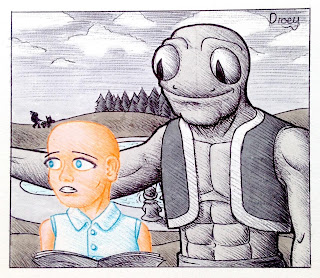
A Katou Christmas

To wrap up this festive collection is a rather novel piece featuring the Katou Twins!


Inspired by a drawing base, this two paneled strip tells tale of the time that Jirou got a rather shocking surprise for his brother. The more reserved Ichirou was least of all to expect that the giant box in their room would contain a dancer! Alannah Sugar would dance private around Christmas time for the extra money towards Christmas shopping. But Ichirou was having none of it and immediately censored her, trapping her arm in the process!

With all of the Christmassy art out of the way, I need to inform you of a few changes that are coming to Droey's Draws in the new year. The schedule is changing and now I will be releasing content weekly. In addition to this, I will be launching the official Droey's Draws Instagram where the latest content will be uploaded. The content you see on this blog is not likely to be uploaded to Instagram and the YouTube channel may be taking a break in order to make way for my college work. I hope to keep the channel up and not to abandon it completely so in the same case as with Instagram, I'll be uploading when I can.

Look forward to another year of Droey's Draws content, however you chose to follow the journey. Hope you have been enjoying Christmas and that a happy new year awaits you!

Wednesday, 25 December 2019

Christmas Dinner

What luck that one of the scheduled days for posting would coincide with Christmas day itself? Though worthy of being the grand finale to this collection, here's an illustration that I couldn't not post today.

Click image to get a larger view

It's time for the Christmas dinner and there's quite a gathering this year. Friends in Droey's circle, both old and new are here having a lovely time.

Tenvad and Paddy aren't eating, since some Technobians can't eat food, yet are sat a a corner of the table to soak in the good company and chat together. It's a wonder that Chrissie Mason is attending as a guest rather than a host! Nevertheless she is welcome and delighted to bring a plus one, she's recently started seeing someone who calls himself Gabriel Snow. He's new to the area, although there's something awfully familiar about him, but no one can work out what.

The biggest surprise this Christmas is that Gary and Lexi are not focused on arguing with each other!  There have been a couple of noticeable blips however, they're most likely just being merry for show- only to follow it up with a riot when they get back to their flat! Everyone else has already pulled their Christmas crackers and Lottie is holding the last one as she reaches across the table to pull her's with Evangeline. Evangeline may have had a little too much to drink though as for a laugh she tries to pull the cracker with her trunk!

John has been trying to charm Ida with his humour, and so to his aid come the Christmas cracker jokes that everyone has gotten over. John reads the jokes as he observes how much he can make Ida laugh. Ida laughs to be polite but has to admit that John has successfully made her laugh with the jokes on a few occasions, maybe it's just the way he reads them? Mac and Quaid weren't expecting to be invited, but Droey decided to invite them over! They remember having taught Droey and John so enjoyed catching up with Mac's former drama students. No doubt Mac and Quaid will be up and dancing later!

Lastly there's Anne Natalie and Droey. Of course Anne Natalie was going to attend her best friend's Christmas dinner. She's even dressed up in a few design for the occasion, sporting a green dress with a yellow jacket sporting her trademark start emblem. Anne tried Droey's Christmas themed hat on and it happened to suit her very well, Droey even whistled- with the use of a Christmas cracker prize! Anne placed Droey's hat back on his head as he handed over the whistle to let Anne have a closer look.

How are you spending Christmas this year? Be it with family or friends, I bid you a merry Christmas, don't forget we've got one more Christmas inspired post to go so be sure to come back in a few days!

Saturday, 21 December 2019

Tree Or Dalek?

Anne Natalie was feeling festive so she created a Christmassy looking dress with the help of another fashion designer!


Anne Natalie met Auriella through her neighbour, Droey. Both have experience in designing and making clothes, only Anne's taste is a little more quirky whereas Auriella is doing an apprenticeship for Savile Droe. The two of them collaborated together to design a dress that coincided with the festivities of Christmas.

The dress' design was inspired by a Christmas tree and featuring a spotted bauble pattern, tinsel sleeves, ribbon lining and reflective dots along the lining that resembled snowflakes. It was a beautiful, quirky dress that was clearly commemorative of Christmas, but Auriella saw something else in the dress' appearance. The spotted pattern on the dress reminded her of a famous alien race. Anne Natalie tried on the dress, which Auriella pointed at and quoted 'Exterminate!'. Anne Natalie laughed as Auriella started moving her around the room pretending she was pushing a Dalek about!

Do you or your friends have any quirky Christmassy clothes to wear this year? If you don't, why don't you draw one of your characters wearing something quirky and Christmassy?

Wednesday, 18 December 2019

Snow

Last December I did a once colour challenge involving the snow. Well here's another one with a bit more going on!


I started off with a piece of Droey building a snowman. I was going to have him making a more fabulous looking snow sculpture but Droey's dislike of the snow would probably drive his patience and hold him back! So we have a fairly simple snowman with a nicely sculpted face which I think would be more believable of Droey's capabilities.

Then I thought about the inclusion of Agrius Moth and that's when things got interesting! I was thinking of having Agrius pose for a sculpture but once I finished drawing him I realized there isn't anyone who would be convinced to do such a thing for him, after all Agrius doesn't have any minions!

Agrius does however have a friend who you will only have seen in the Area 51 themed YouTube video who seems to be one to get involved in crazy shenanigans. So I chose to bring back Collin Cloud with a giant snowball that he would be preparing to throw. It seems he and Agrius are either in a snowball fight or are about to ambush someone.

The illustration was done using a sky Uni-ball pen to outline and then some Tombow pens for the colouring. I only added shading to the snow rather than the characters as well, so I could distinguish between the snow and characters more clearly. I would have added colour to the characters to make them standout from the plain border surrounding this artwork but didn't know what to do without potentially throwing off the compoisition's existing qualities.

Not exactly a Christmas themed piece but with only three to go I'm sure the remaining artworks will be very Christmassy. Hope you're beginning to feel ready for Christmas Day!

Saturday, 14 December 2019

Elf Service

I said I wanted to do some more story based stuff again, well here is a three panel comic strip. But who's that making an appearance at the end!


It was only fair to give Elle a cameo since her series wasn't running this Christmas. It was also a funny concept to have actual elves teaching people how to work as elves you see in shopping malls. In Jansterwick this year, Elle has been chosen to give people training and she's got the help of Chrissie Mason and a less than enthusiastic Gary. Lexi put him up to it most likely, they've got to get some work!

I did this comic strip in black and white, using just a couple of grey tones to make the visuals more interesting. I like how this has turned out and think it looks better than the pure black and white tones used in the Santa and Elle series! Speaking of which, I was concerned about the speech bubbles not standing out well enough so I drew them in red much like the Santa and Elle series' trait of making Santa red.

This comic strip was brilliantly executed and I only wish it had been longer, this story could have gone somewhere or had a brilliant set up. Another time perhaps. We're half way through this month's Christmassy content, with only four more posts to go. I hope you're enjoying this month's content!

Wednesday, 11 December 2019

Winter Stroll

This piece introduces you to a Christmassy character that I have created, because we all know that one person who's forever obsessed with Christmas! This is Chrissie Mason.


Evangeline and Chrissie are taking a stroll out in the Jansterwick countryside. The two girls are having a chat. Their spirits are not dampened by the cold weather or the risk of skidding on ice as their conversation renders them lost in a world of their own.

I used Spectrum Noir markers here, particularly because the background was going to be made up of blocks of colour and there happened to be a perfectly wintery looking selection of colours for a background. It stops the background from looking empty but doesn't allow it to steal from the characters whose colours are much bolder.

Normally I don't think a piece like this would qualify for a Christmassy artwork but I think the introduction of Chrissie Marie makes up for that, you certainly get a festive vibe from her! Come back in a few days to see her alongside more characters in another Christmassy artwork.

Saturday, 7 December 2019

Mistletoe Kiss

If you're a reoccurring visitor to this blog, you're most probably aware of John's interest in Ida. So who do I chose to draw when I think about a mistletoe kiss? John Esposito  and a confused but amused Ida Noe.


John has planted some mistletoe in a room and waited for Ida to come in and step underneath. As soon as he noticed that she stood beneath his cheeky trap John rushed over and gave Ida a surprise hug, followed by a kiss which landed on her cheek. Ida was indeed taken by surprise and amused by his actions, even tickled slightly.

I did this piece in a comic panel style because I hadn't done anything like that in a while and thought it would make a nice change. The colouring was done in watercolour pencil as this is a medium I hadn't used for a while and the colours are mostly bright in my collection. Despite the lack of skin-toned pencils in this collection I think I did very well to match the skin tone of John Esposito. For Ida's skin it was easier as I had a terracotta which did the job.

Coming up with story ideas is not as easy as illustration ideas which is why I've been struggling to anything in comic format lately, but I want to get back into it. Hopefully this will be the start of that coming back, time will tell!

Wednesday, 4 December 2019

Michow Being 'Moory'

It's beginning to look a lot like Christmas, so here's the first of this month's Christmassy artworks! One thing we associate with Christmas in the modern day is Michael Buble, so it's only fitting to start with an illustration of Michow Mooble!


I've given him a change of clothes for the winter season. Normally he's be wearing a lot of blue but for Christmas he's brought out his green and reds! Michow Mooble loves Christmas as his favourite time of year and definitley enjoys going around to sing carols.

I did this illustration in Tombow markers with some coloured pencil. This combination helped to make a vibrant illustration. It's a simple piece but beautifully done and given that's its not obviously Christmassy, it makes for a nice first piece. But the rest of this collection is intended to be much more merry than usual!

Saturday, 30 November 2019

Mothvember

It's Movember, but someone's lost their facial hair! Who do you think is responsible?


Agrius Moth has taken some hair removal cream and used it on Droey's facial hair! Poor Droey is not happy about being baby-faced. Agrius Moth on the other hand has an impressive head of facial hair which he has grown out for this month. But the truth is that he's actually purchased some false facial hair and stuck it to his face! He's trying to convince people that it all just grew overnight!

This illustration was done in my toned sketchbook which I wanted to play around with. It's done wonders on Droey's skin. Of course I was going to do an illustration with white elements in a toned sketchbook. Unfortunately the blacks seemed to come out in a dark grey which was not intentional. This could be because I did not place enough black pigment down or that it is the paper causing this change in colour. For Droey's shirt I took the 'baby-face' idea and designed a Teletubbies themed shirt with the baby sun on the shirt.

That's all for this piece, but as you may know this is the last post of November. Normally this would mean you're in for a Santa and Elle series but there has been a change of plans this year.

For the past two years we have had the Santa and Elle series which has entertained readers and art fans alike. Unfortunately this will not be renewed for a third year, at least not this year. Instead we'll be focusing on the main Droey's Draws cast going about their festive activities, posted according to the regular schedule. I'd like to be able to focus on Elle the elf but I'm going to need more time to prepare a third series of escapades for her and I'd rather give you 25 decent stories than 25 poorly written, rushed ones. All the same, I hope you enjoy this year's festive content!

Wednesday, 27 November 2019

Droey and Gym : Part 2!

Do you remember the comic strip with Droey going to a gym? Well this is something that happened later that day, enjoy the comic strip!


Ariana Sketchbook and Taniya have been attending the gym and they are feeling good about themselves. However when it comes to their downtime, it seems Ariana is going to put her thoughts towards a pop song instead of her goal!

For anyone who finds the joke too obscure, the last panel is a reference to the Ariana Grande song 'Thank you, next' in which the lyrics have been misheard as 'Bacon, eggs'. I thought to make this reference more obvious I'd have Ariana dressed like Grande as she appears in the music video for Thank you, next.

This comic strip has appeared on YouTube, hilariously but poorly dubbed my myself!


Saturday, 23 November 2019

One Colour Challenge | Seance

There isn't really a story to this piece, it was just a fun idea I wanted to try since I have been pretty busy lately. So here's a few characters at a seance.


From left to right this piece features the Weirdo with no name, Foxy Archi, Witch, Sabine and Mona Mohawke; the latter two I haven't drawn in a while so I thought I'd bring them back.

I didn't intend for this to become a one colour challenge, but because of how busy I had been lately I was hoping to get this artwork done as soon as possible. I wasn't even sure on what mediums to use for colouring this piece until I decided to use pencil but with only one hue. A total of four pencils were used in this piece, all shades of purple; the line art was done with a purple pen.

I think this allowed me to effectively show my understanding of tonal studies with the one light source coming from the sphere. I almost convinced myself to put some yellow in this piece for the lighter areas but decided against it as I felt this piece was fine just being purple.

Have you tried the one colour challenge? Give it a go, use any colour you fancy!

Wednesday, 20 November 2019

Don't Move Jirou!

Don't move Jirou, there's a spider on your head!


Jirou has a phobia of spiders. He was having a chat with Anne Natalie, trying to impress her, when Ichirou noticed that there was a Spider crawling on Jirou's hat. Ichirou tapped Anne and eyed the spider with a smirk on his face. Anne noticed but didn't know about Jirou's phobia.

'Oh goodness, how did that get there?' Anne asked when she noticed the spider. Jirou was puzzled.

'How did what get where?' he asked. 'There's nothing on my handsome face is there?' Jirou felt around his face and there was nothing different. 'My clothes?' all of the sudden Jirou was frisking all over his clothes to check for any specs of dirt or anything that might spoil his looks. Ichirou tried not to laugh but let out a little snort. Jirou looked up, glaring at his twin. 'It's my hat isn't it?' Jirou stood up and was about to feel over his hat when Anne grabbed a hold of his arm.

'Careful, don't hurt it!' Jriou's eye widened with fear, he now had a good assumption of what was on his hat.

'Ichirou, Anne, is there a spider on my head?' Ichirou tried so hard not to chuckle but failed to properly fake a serious tone. 'There is isn't there?' Anne firmly placed her hand on Jirou's shoulder and gave him a stern look.

'Don't move Jirou! Let me get it.' Anne gently brushed the spider off Jirou's hat as he winced with fear. He was also rather embarrassed about being made to look cowardly in front of Anne Natalie. Ichirou grinned for a long time afterwards, he'd been given his entertainment.

This would have probably been better to show up around Halloween time, but better late than never eh? In any case Christmas isn't so far away, so I'm sure all the spooky vibes will be gone by then. Stick around for more Droey's content!

Saturday, 16 November 2019

Lottie's Road Trip

Droey and Co are going on a road trip and Lottie's hired a nice big car to take them all in! Let's see who's along for the ride.


Lottie is of course going to come along for her own road trip, she's the one driving! She's not the only one who can drive, Anne is also capable of driving but Lottie nominated herself as driver and nobody complained about it. Anne got to be the DJ instead, she connected her phone to the car radio and played her driving playlist for most of the trip.

Droey came along but didn't manage to get a window seat. He usually likes to be at a window seat for the view but didn't mind where he was sat because he could just look straight ahead for the view. He also accepted the middle seat as he rarely has any need to get up from his seat when he is on a vehicle, so it seemed the most convenient place to sit. Ironically, Droey finds himself needing Lottie to pull over, but there isn't a service station in sight! Worst of all he is sat between two of the grumpiest people he knows, so he's too shy to say anything.

Gary and Lexi were invited along since things really haven't been great at all between them and Lottie, learning the art of psychology, thought it would be a good chance for the two of them to bond and reconnect. They both accepted (Lexi only accepted on the conditions Gary came along to be under her supervision) but had a row before getting in so they refused to sit next to each other. They continued to give each other the cold shoulder throughout the journey, occasionally making passive aggressive remarks about each other. Poor Droey!

Behind that trio were John and Ida. John had been put in charge of the refreshments, a given since he works at a restaurant. John was very pleased to have Ida sit next to him and every so often he would flirt with her. He even tried to feed her a strawberry romantically, very forward of John!

Tenvad was in the boot of the car, as the car they hired did not have proper Technobian accommodation. Tenvad was okay with this as she laid back with a microphone in her hand to better project her directions. She was in charge of the map and it's directions.

Lastly there is a stowaway, someone nobody truly expected to tag along for the journey. This is especially because he wasn't invited, it's Agrius Mouth! Agrius has been on the roof car surfing this whole time, I suppose it's easier for him than most people given that he has an extra pair of hands to grip the car with. The only reasons nobody has noticed that he's up there is the lack of a sunroof and that Anne's music is too loud to hear his footsteps with! Gary may have heard, but Lexi just accused him to being stupid.

How would you or your characters manage a road trip? Take them out for a journey sometime and see what they get up to!

Saturday, 9 November 2019

The Pricness And The Hedgehog

Someone has gone missing, a lady from rural land that led her kingdom into battle. She one day took off on her noble Hedge-hose and to this day remains missing. Here is an artist's portrait of her.


This is Princess Kitty and her Hedge-horse, Mr. Darkcie. This painting was painted from reference of a photograph taken before Princess' most recently fought battle. It is one of the most valuable paintings in modern history and kept in Princess' palace grounds so her family can see her everyday. The whereabouts of Princess are unknown, though rumors have gone around that there is a likeness of her living in Birdbarneslynn.

This illustration was done similarly to the Droey illustration of him obsessing over Chocolate Brownie ice-cream. The line art is done with a sepia toned pen and the colouring has brown/dust tints all over. This helps to gives the painting a more aged effect.

If you ever find Princess Kitty, give a shout out as her people would be interested in finding her again! Keep your eyes open in future Droey's Draws works, she could be there...

Wednesday, 6 November 2019

Rosie Quill

Recently we saw Droey and Co going to Comic-Con and one of the celebrities there was known as the voice of a fictional character, let's take a deeper look into that shall we?


This is Rosie Quill, the hedgehog with a hammer. The game is rather simple, you explore a fictional world dominated by robotic bat creatures and smash them up with your hammer. Rosie is a feisty hedgehog with a remorseless sense of humour who is out to seek the attention of her idol the Robat Ruler. Will be be able to escape her clutches, it's up to you to see that he doesn't!

What does this concept remind you of? Could it be Sonic the Hedgehog? Well you'd be very right if that was your guess! I based most of the visual concept on Sonic the Hedgehog with Gotham elements inspired by it's city and Harley Quinn. The plot is merged with Sonic's to suit the personality of a Harley Quinn like character. The environment was mostly made to look more urban, with this interesting quirk of traffic lights in the ground that release spikes!

Would you play this if it was a real game? I'd certainly be interested in giving it a shot! If you're stuck for drawing ideas maybe you can parody an existing property or draw some fan art, it could be rather fun.

Saturday, 2 November 2019

Ida's Hat

For Comic-Con, Ida dyed some of her hair black to fit with her Harley Quinn costume. Now she has gone and dyed it fully black and is experimenting with a new style!


Ida found a pink hat with a white brim and she loved it, but she didn't think it complimented her red hair. Now her hair was black it felt right for her to buy the pink hat and she had no regrets. Ida loved her new look and was sure to let people see her new hat. A lot of people struggled to recognize her initially because they were so used to seeing Ida's distinct, red ponytail over the rather plain looking black pigtails. Even though John claims to adore the new look, a lot of people could tell he missed the ponytail more. Will Ida consider reverting back to her old look?

For this piece I sketched using a pink ballpoint pen, the results are so much more beautiful if you sketch with them rather than draw over pencil, I think I'll drop that method from now on. There are just some forms of media that should not be mixed together. Have you ever learned that the hard way what supplied do and don't go together? Share your artsy mishap stories, I'm sure we all have several!

Wednesday, 30 October 2019

Comic-Con Capers!

Comic-Con is a wonderful event is it not? People dress up, meet famous people, buy awesome merchandise, get pictures taken, it's madness in the best way! Let's see what Droey and Co. are up to at the Jansterwick Comic-Con!


John and Ida have been prepared for this event for some time, so prepared that they bought tickets! You wouldn't have thought that Ida would have been able to decide what to dress up us but after dabbling with some ideas she decided the Harley Quinn costume would be easiest to assemble. When John found out about this, he immediately jumped at the chance to cosplay as Poison Ivy. The idea actually came to him when Droey jokes about it for the fact of John being a redhead. Their costumes look better than Lexi's costume of Rosie Quill, she was keen to get in quickly to save queuing to meet someone famous!

Agrius Moth decided to go to Comic-Con as himself, since The Convolvulous Hawk is only the greatest villain of all time! However most people who attended didn't even recognize him, much to Agrius' disdain! Boone even believed that Agrius was cosplaying as Loki from the superhero films! Agrius was offended by this remark but secretly impressed given the reputation of this villainous character.

Droey had come for one particular reason, to meet a celebrity! Droey is a fan of the game series Rosie Quill, and her voice actress was going to be present at the Comic-Con event taking photographs and signatures! Droey hade an artwork of Rosie Quill especially for this occasion and was able to get a signed copy of it, while giving the original to Honey Portraie. She loved it and made sure the artwork was safely placed with her luggage before taking a selfie with Droey.

Gary was around and looking through the stalls for some decent merchandise. He had been saving up for this event for ages, Comic-Con can be expensive! As Gary browsed the stalls, he came across it, something that he desired enormously! There was a mint condition figurine of Amber, from the battle royale game Underseek. She was only one of Gary's favourite characters, his favourite shirt's design was inspired by the wings on Amber's costume. It may have been a costly seventy pounds, but Gary felt it was worth the expense to collect this special figurine.

Have you ever been to a Comic-Con, I hope you enjoyed it! If you haven't, you can always send your characters to a Comic-Con to see what they get up to?

Saturday, 26 October 2019

Just Monika

Earlier this year you saw Monika from the game Doki Doki Literature Club being coupled up with Marceline the Vampire Queen. Here is the painting of Monika that was featured in that artwork.


I didn't talk much about this painting when it was first seen so this is an opportunity I'm taking to make a fuss of it.

I knew I wanted to recreate the screen-capture of Monika when she takes over the game, since this would be something that could adapt to any of the other characters legible for votes. This is the first time I have recreated something in a long time and I enjoyed it.

I drew Monika in my realism style rather than the anime, so that it wouldn't be a complete recreation, but some elements still remain anime in style, which I had forgotten to change. This is most noticeable in the neck which is incredibly think for a human and perhaps in the proportions of the face despite being more realistic than Monika's anime art.

Watercolour Pencils were used for this illustration, in an attempt to fill the page without a pencil texture. While there is still some pencil texture, there are no white specs in the illustration that most pencil coloured illustrations have. Some the gradients also work quite nicely despite not having the smooth, digital appeal from the original. I'm also surprised at how close most of the colours came to be.

Friends who has seen this being worked on claimed to prefer it to the official artwork, would you agree with them or is the original piece still superior? Have a go at recreating something, it's not cheating, it's learning!

Wednesday, 23 October 2019

Take A Seat, Droey Drawson

Droey's in a spot of bother, the chairs have gained sentience and they're sick of Droey sitting on them!


This was a funny idea I had going in my head for months, as an inside joke has developed that chairs are out to get me. So at last they're coming to get Droey! This was an interesting challenge as without any organic features, getting chairs to express feelings or emotion is quite difficult. Quinman provides a similar challenge but he has a human body, the chairs are a completely different story! The  expressions had to be left to the legs, how each chair stood. So for the green chair confronting Droey it made sense for it to be leaning forward and facing upwards to demonstrate authority. The grey chair behind Droey was an easier task as all I had to do was pose it to be ready for someone to park their rear.

I was going to stick with Magicfly markers for this illustration but the background felt too bland so I decided to use coloured pencils. The pencils were also used to add shading to Droey's skin and white accessories. I've been using Magicfly markers for a year now and I think the quality of their performance may have dropped since. The ink is streaker and I've had a couple of cases when the paint is liquidy enough to bleed or darken the tone greatly, which luckily did not happen in this piece!

This illustration was recorded for YouTube, here's the video!

*youtube video

Will Droey escape the wrath of the chairs? Well if you don't see him again you know that they've gotten him, but I'm sure Droey will be back again soon, hopefully you will be too!

Saturday, 19 October 2019

The Greatest Showmoth!

Ladies and gents, this is the moment's he's waited for. Well, it's at least a moment for Agrius Moth to be in the spotlight again as the first ever illustration I have done on toned paper!


This was an illustration idea I had been wanting to do for a while, I also wanted to find a toned paper sketchbook because I think it will benefit my ability to experiment and to shade. When I saw the chance to bring this piece to life I could tell from the moment I put pencil to paper that doing so on this toned paper would be perfect.

As you can see I went a little overboard with the white. White is something that can't be used so well on white paper, for obvious reasons. This makes toned paper a white pencil's best friend, and I went wild with it! There's several areas I used a white pencil to shade with, it also looked a lot brighter before I introduce the white pen to this illustration. I used the white pen strictly for the shiny highlights and the outermost edge of Argius, then the decorative elements in the background.

Agrius was coloured in with pencils while the background used two cool coloured crayola pens. I chose a dark blue and a lime green for the spotlight, referring to phrase 'stealing the limelight'. The pencil work on Agrius stayed on the warmer end of the colour spectrum, using colours from his original palette such as red and gold.

Have you done any illustrations or sketches with toned paper? If you get the chance, even if the paper's just coloured, give it a shot because you might broaden your horizons. I'll certainly have the chance to do that in this new sketchbook!

Wednesday, 16 October 2019

Those Shoes Are Hard To Draw!

I love those 'Draw This In Your Style' pieces, it's a wonderful trend that I don't want to give up, so here's my shot at one of them!


And now here's the original image that inspired this challenge.


Regarding this girl's features and colours I tried to stay as close as possible but wanted to make a slight tweak to the colour scheme. I felt the blue and purple were too close in shade so I tried using lighter tones. Unfortunately the purple was lighter than I expected and resulted in the hair and crop top still being rather similar in tone. In hindsight I feel I should have swapped the colours of the top and leggings, since the yellow makes the trousers look like the vocal point of the design.

My other personal flaw with this reinterpretation is how everything seems so close together, but that's what I get for not giving myself enough space on the page. I would have moved her right arm further out slightly had this not have been the case.

Despite these two minor issues with the aesthetic of my illustration, I really like how this girl has turned out. It's a finish that looks almost like it has been printed and the bold outlines is something I haven't used in a while and dearly missed. I am always content with the results of 'Draw This In Your Style' artworks and look forward to doing this again, I might even create an illustration for you guy to draw in your style!

Saturday, 12 October 2019

Droey and Co. in London

Anne Natalie has taken a few day's work in London so she has brought Droey and Tenvad along with her and they get a chance to enjoy a view of the city.


So this is a first time for me and an experimental piece I enjoyed making. I was out one night with a couple of friends who were looking to take photographs and we got the chance to look over the view, which at night I always find to be a beautiful sight. This is what made me want to do this idea, though the image used in this piece is not our own but a cityscape of London. This is inspired by the works of Victoria Wood's 'Puppy Dog Tales' and the art style of Lauren Child, for which you'll know her most for 'Charlie and Lola'. My idea was to draw the characters as a foreground looking over a photographic background.

There were a few ways I could go about this. One method could be to have made this piece entirely on computer, which would have the cleanest effect. Another way would be to have drawn the character and then scanned them onto a computer, following the first method's idea of putting together the composition digitally. The third method, the hardest and which I tried without thinking of the other methods, would be to print the photo and cut it to fit the drawing of the characters.

I was able to borrow a fellow artists' crafting knives to cut the image over a tracing made of the outlines. This way I could accurately cut the shape I wanted to without risk of cutting the drawing itself. Once this was done I carefully stuck the image on top using a glue stick.

When drawing the characters, I used my method of applying pen ink and then pencil shading so that the characters would be in fill colour, unlike what happens when you colour with just pencil and you're left with little white specs. This would allow the drawing the blend better with the photograph, while creating enough contrast to still give away that it was drawn and not a photograph.

Would you be interested in seeing more pieces like this in the future? I could use more photographic backgrounds or even use pictures to create a collaged effect such as the use of patterns, I'm happy to hear your suggestions or see how you tackle this method yourself!

Wednesday, 9 October 2019

Drummer Girl's Favourite Bird

This is Drummer Girl, she likes birds. She likes them so much that she's found an undead bird and decided to give it a massive hug!


Drummer Girl is the percussionist of the band Bichon Face and the most down to Earth in her group and has the hobbies of making art and bird watching. Anything that flies has her interest, which is probably why she is dating a butterfly.

Some of you may remember Silverside, well at least that what's his name was assumed to be. Drummer Girl has renamed Silverside and now he's called 'Thrasher'. Thrasher is a zombie parrot from the land of the Sbookies and has never been loved so much to the point where someone wants to keep him! But perhaps Drummer Girl is giving Thrasher too tight a hug? I'm sure over time she'll learn to be more gentle with his semi-decomposed body.

Do any of your OCs have unusual pets? Fictional creatures can come in such a wide variety, that's probably why Pokemon is still going!

Saturday, 5 October 2019

Hair I Am Again

A long time ago Droey had a hair cut and the xevered hair made it's own way into the big wide world. Now over two years later, he's returned!


This short comic strip was a chance to Lottie and Lexi a bit of attention, and for Droey to wear one of his many shirts. Those of you who have been around since the beginning may recognize both the shirt and the hair, as both of them have appeared on this blog before. But a lot of happened since then, both in and outside of their fictional universe, so when I had to urge to bring someone back, it felt like the right time for the hair to return.

The only panels I'm not so happy with are the two smaller panels from the top right, I feel that they do not successfully capture Droey's expressions the way I intended them to, thus cramping the illustrations. A minor issue in the last panel is that I think Lexi is too large compared to the other characters, but aside from these features I've pointed out I'm really happy with how this comic strip turned out.

Have you ever had an old friend or relative come back into your life? Maybe you have an OC who hasn't met with someone in a while, it might prompt some art to develop your characters.

Wednesday, 2 October 2019

Big Foot At A Bus Stop

Do you remember Lou from the Sbookies last year? For those of you who don't, this is Big Foot and he's been spotted out in public!


It's been a tiring day for Lou as he decided to catch some breath at a bus stop. Normally he's very shy and doesn't like to be seen around people, he wishes he was as hard to find as the still yet to be found Princess Sketch. But Lou was so tired today he couldn't care, which meant the weirdo with no name was stood right next to him! She didn't seem to care that Big Foot was sat on the ground next to her, she was more interested in what was happening on her phone screen. Once the first bus arrived, Lou was back to being on his own, though he was fast asleep by this point! Lou would go home, tomorrow.

I really loved the concept for this piece, but hated the execution. The line art, particularly on the weirdo with no name was terrible (hence he switch to denim trousers instead of her usual skirt). To try and make up for this I decided to experiment with the colouring. So while Lou is given his official colour scheme, the rest of the illustration follow the five colour pattern from our weirdo's hair. The missing poster was a last minute touch that helped to make this illustration more interesting. It gives us a piece featuring three characters, all of which he haven't seen in a while.

Will we ever find the missing Princess Sketch? Maybe one day you'll find the answers on this blog!

Saturday, 28 September 2019

I'm Going To Eat Some Biscuits!

Today beholds a two panel comic strip featuring two characters you won't have seen since February's YouTube video. Here's a rather comedic introduction to the engaged couple Kaboom-beat Sketch and Lissy.


This was just a funny sketch I had to put together, and a good way to bring back Kaboom-Beat and Lissy. These two are a lovely couple who are very close to each other. Kaboom-Beat has unfortunately broken one of his collectible Transformers and so has resorted to cheering himself up with digestive biscuits.

I was prompted to do this with the quote 'I'm going to eat some biscuits' and was required to include Kaboom-Beat in this strip, so it made sense to include his partner, Lissie. I went with my flat coloured pencil style of colouring since I didn't have much free time to work on this comic strip, this explains the simplicity of the purple background as well.

That's all I have to say about today's piece, but we're gonna be seeing to in light of October's arrival we'll be seeing the return of one of the Sbookies on Wednesday! Which of the thirty one spooky creatures will it be? Come back next Wednesday to find out!

Wednesday, 25 September 2019

That Time Jazza Trusted Us With Photoshop | PART THREE

Ages ago Jazza set up an art challenge for us to Photoshop him in whatever way we pleased in order to roast him. I took this opportunity at the time but never shared the work I had done! So after over a year in hiding here is one of three pieces that I created.


Out of the three I created, this is the obvious favourite and a perfect choice for a grand finale to this trilogy!

You may notice, I actually gave time and effort to this piece, but I also used every single Jazza that we were provided with! The stage background was sampled from Google Images and was a perfect set up for my intention, a performance of Jazzas with no control!

I think it took about an hour to decide where each Jazza would be placed though for some of them it such as the airborne Jazzas it was pretty easy. I knew I wanted the screaming Jazza to be center stage and that the Jazzas which were cut at the hips would have to be scattered among the seats. As each Jazza was applied it was becoming easier to see which Jazzas would go where and who they would interact with.

Effects were applied not to just the Jazzas but the piece overall, after I knew where each Jazza was going. I was using effects such as gradient overlays, satin and the inner glows. The colours I would use to apply these effects were golds and browns so that everything would blend with the background stage; in hindsight it was like a long version of using the colour balance tool.

Looking back on these, it resembles one of the those renaissance paintings where it's hard to tell what is happening, but brought into a modern light. I remember having tremendous fun creating this and it is still a delight to look back on, one of my finest Photoshop jobs to date! Have you ever played around with Photoshop to see what kind of crazy art you can make? It doesn't have to be for silly edited images, you can create all kinds of art with it or any digital program with artistic tools. To those who have stuck around to see all three of these Jazza Photoshops, I bid you my congratulations for surviving the weirdness!

Wednesday, 18 September 2019

May The Force Be With Foxy

This is Foxy Archi, some of you may have noticed her in the YouTube video from March, about Droey's Spidersona. There's not much you know about her, but I can tell you she knows how the wield a light-saber!


Foxy recently started training with a light-saber and has proven to be an excellent warrior, crossing her is a dangerous idea. However it has become apparent that she is learning the ways of the dark side as the light-saber's crystal has started bleeding, lets hope that purple doesn't turn to red!

I did this illustration using my Ohuhu markers, a black brush pen and my white pen. Firstly I coloured the illustration with the Ohuhu markers, creating areas with purple highlights that would be both the lighting from the light-saber and the reflective lighting. I late went over both of these with the white pen to make the highlight effect more convincing, with the reflective lighting the white has faded enough to look like a weak purple highlight.

Along the bottom of the illustration I used the same dotted effect from the lightsaber lighting to add a gradient that gets lighter. Along the top I used my black brush marker to create light strokes that I would build up in smaller strokes closer to the top to crate a gradient that goes from the deep purple to black.

I have noticed that unfortunately the gradient lighting doesn't cover the entirety of the bottom and actually cuts short a couple of millimeters before the character, which is quite off-putting! Other than that I am very happy with how this illustration has turned out and am looking forward to seeing what my next Ohuhu illustration turns out like. Be sure to come back next time for the conclusion of my trilogy focused on Photoshopping Jazza from Draw With Jazza!

Saturday, 14 September 2019

Gorf Meets Candy

Every year I make it tradition that I do an illustration with ball point pens about a giant frog man who has gained the name Gorf. But unlike the previous two, this illustration is not set after the horrendous murder he is believed to commit, but is set out in the open!


I was looking up some prompts and I found a quote along the lines of only seeing in grey until someone came in and they were a burst of colour. So I've decided to make it official that Gorf is colour blind. So I knew following this prompt I was going to go back in time to the day that Gorf and Candy first met, it was just a matter of deciding how they would meet. It was after looking through images of introductions that I was able to decide on Candy asking for directions, which despite not being perfectly clear in this image, is implied with my best efforts to be what is going on.

I don't think my ball point pen shading was as effective as it was the last time, but the previous illustration was intentionally darker while this one is set in natural daylight. Candy's shading is up to the standard I had wished to achieve and so are backgrounds elements such as the hills and the trees. Like the last time I used my Tombow pens to apply base colours to the illustration which has allowed for the variety of greys that is seen. But perhaps the most unique part of this piece compared to the previous two is how there is no red; no blood!

What do you think next year's Gorf and Candy piece will be like? Will I recreate an illustration or dive deeper into their story? Only time will tell, in the meantime why not try having fun with ball point pens yourself?

Wednesday, 11 September 2019

That Time Jazza Trusted Us With Photoshop | PART TWO

Ages ago Jazza set up an art challenge for us to Photoshop him in whatever way we pleased in order to roast him. I took this opportunity at the time but never shared the work I had done! So after over a year in hiding here is one of three pieces that I created.


'Circle Of Jazza'

A truly majestic abstraction of Jazza that many will look at and wonder what the heck I took to come up with this, but I can confirm I'm just insane! There was just one image of Jazza waiting to be mounted onto a mighty creature to ride, little did he know I was thinking of making Jazza ride another Jazza! It doesn't particularly help that Jazza is looking back to the previous Jazza and so forth!

The only two flaw with this start at the legs which meant I couldn't create a truly limitless loop, but the idea is still there. The second flaw is the ropes being held by Jazza, I haven't connected them all together, so there's breaks between every two Jazzas! If I were to go back to this piece I would add in the remaining robes to complete the circular link.

Much more Photoshopped than the first one, wouldn't you agree? Be sure to come back on the 25th September for the third and final edition to this trilogy, or just come back every Wednesday and Saturday for more artistic content!

Saturday, 7 September 2019

Love Is In The Air... And So Is Cheese

Is that John and Ida on a date? Well, John thinks of it as a date but Ida sees it as just a friends' outing that nobody else bothered to show up to. But just how many people would be interested in an entire museum dedicated to cheese? That's probably why it's not very big.


So creating a museum that is all about cheese, it was interesting. I was prompted both museum and cheese which is how this location has come into existence, but enjoyed filling up this scenery with mostly humorous ideas. The center of the piece was obviously going to be some actual cheese contained within a glass case so that the cheese couldn't be affected.

There are five other features in this illustration. From left to right, the first feature is the cow's head which is said to be the first cow milked in the area. Next there is a joke book written by Jerry Camembert, the most cheesiest jokes. Visible above the cheese there is a poster asserting that Droey Drawson is not allowed on the premises! What did he do to get a poster like this? Not far off there is a painting of the local cheese critic Wallace Fonda and lastly there is a bowl and some Fondue forks.

The colours for this piece were selected from a cheese platter image found on the internet, while the lineart is ballpoint pens. This is orange for the most part and red for the character so your attention is more likely to be drawn to them. Even though it looks like it, there is no blue in this illustration, that's actually a very desaturated Jade Green!

I loved creating this illustration but the colouring for this was the most interesting part and something I haven't done in a long time. Both John and Ida were coloured using specific colours from images when I created them so having an illustration of them coloured the same way feels like a nice continuation of their qualities. If you want to colour an image but are not sure how to colour it for greater appeal, you should give this method a try because it's bound to work well for you!

Wednesday, 4 September 2019

Costume Swap - Anne Natalie and Eliza Barnsley

Anne Natalie and Eliza Barnsley aren't too different from each other. While they never knew each other for most of their lives, they have met on a few occasions through their mutual friend, Droey. One day Anne suggested that they swap outfits and Eliza, though unsure at first gave in to the experiment.


Now when Eliza agreed to this, she was expecting the chance of try on one of Anne's many designs but it turned out she would be wearing her trademark towel! Anne on the other hand was rarely seen so covered up on a good day. They didn't put on each other's clothes but Anne had made them by studying the original outfits and redesigning them to fit each other. At the end of the day it amounts to Anne having a new trendy look that she might wear again and Eliza has a new bath towel.

Have you ever swapped clothes with someone, or swapped the costumes of your characters? It's a strange idea but not unheard of, see how strange the costume swaps can get!

Saturday, 31 August 2019

That Time Jazza Trusted Us With Photoshop | PART ONE

Ages ago Jazza set up an art challenge for us to Photoshop him in whatever way we pleased in order to roast him. I took this opportunity at the time but never shared the work I had done! So after over a year in hiding here is one of three pieces that I created.


I didn't do this with the intention of roasting Jazza but having fun with Photoshop instead, so this piece is a fairly simple one. These two Jazzas just seemed to go so well together that I had to combine them. The only real editing that would be to these is the removal of their backgrounds and then duplicating the hand of the friendly Jazza to overlap grumpy Jazza.

That's about as much as can be said for this piece, but it is the simplest of the three. They're only going to get better from here! Come back on the 11th September for the second edition in this Jazza themed trilogy! Or if you'd rather, come back every Wednesday and Saturday for new content on the blog!

Wednesday, 28 August 2019

Behind The Scenes | New Droey's Draws Animation

You may have noticed that the intro for my Droey's Draws videos has changed, as well as the outro. Yes I have been giving some of my stuff a makeover but what's probably got you intrigued is the animated Droey Drawson in my videos. Today I'll be discussing how this came to be.


This is a screen shot of the first frame used in the opening sequence. You'll notice the software I have used to animate this footage is quite unconventional. I can't afford much in the way of software yet I occasionally can get access to Microsoft PowerPoint. I don't know if this is still the case but growing up you could find a good amount of videos of people using PowerPoint like an animation software, and since I already had it for school work, I could learn to animate without having to get any new software.


PowerPoint created the 'Animations' toolbox so that people could make their presentations more lively, so this is what we use to make our animated productions on PowerPoint. This is the same frame as the first screen shot but with the animation pane visible. While on the slide every object is visible, certain animation effects will make it so the slide is not clustered with everything at once. Appear and disappear effects were used on the different mouths, and a line effect for the movement of Droey's irises.


The hand waving was done by using a spin effect. In effect options, some of your animations can be modified to do different things, so I could stop the hand from doing a full 360 rotation, as well as get the effect to reverse when it was completed. Using the timing panel I would get this effect to repeat a few times and so Droey waves for the duration of this slide. One thing that can't be controlled with the spin effect is how the object's pivot point is it's center. So to get the hand to rotate from the wrist, I added another shape, making sure it was positioned so that the wrist would be directly in-between the hand and the shape. Grouping the hand and the square together turn it into one object and then you can add effect, don't forget to remove the outline of the spare shape and make it's transparency 100%, this will complete the illusion.


Wondering how I created a Droey on PowerPoint? Well I took the digital rendering of Droey that most people recognize and traced it using the shape tools. There are various circle tools and the curve tool that allowed me to create all of the shapes I needed to replicate the drawing. The star was made using the star tool and tweaking it's settings to make it match. You can tweak many tools by using a yellow diamond when you click on the object or by using the edit points tool. It's almost like the pen tool on Photoshop. Of course with Photoshop there's the ease of being able to just create the shapes and merge them all into one outline, then fill in the colours as you like. PowerPoint doesn't quite have that sophistication but for a software that isn't focused on for making art, it's town tools are admirable.

The outro as seen when viewed as just a PowerPoint slide


There's not much I can say about the outro version of this animation, as it is largely the same as the original. The only differences are the lack of a logo and the extended run time. You can see a few more shapes drawn onto the slide, all of which are included in the extended animation. Given that Droey was going to be waving for fifteen seconds, I thought it would be rather boring to have him doing that without changing his expression. To combat this, I added the facial animations that would allow him to lose patience as he continues to wave longer than he deems necessary. This would be less time consuming that drawing different frames for his arm to stop him waving, it would also be more entertaining to see Droey get bored and break out of his grinning presentation in hopes that the endcard comes to an end.

In an ideal world, I wouldn't have needed to create the eyelids and would have just changed the shape of the eyes. This would have matched the art style, but the problem lied within how Droey is animated. Without the eyelids being a physical shape on top of the eyes, Droey's irises would just break out of his eyes as they move, which would be a most disturbing sight. So at the slight cost of staying true to the artistic style, Droey gains some visible eyelids to his expression.


Now you're probably wondering how I was able to make a film out of a PowerPoint presentation. Well as of the 2007 version (I think that's the case), PowerPoint gained the ability to save it's presentations as Windows Media Video files, which are adaptable to just about any movie making software. This suits me perfectly as I only have Windows Movie Maker to edit my videos in. I saved the presentation file so that I can come back to edit this as I wish in future, then I saved the video files for both the intro and outro animations which could then be edited into the project files for my Droey's Draws videos.

So that's a brief explanation of creating the animated Droey Drawson that you see in my titles from now on. This does not bring promise of further animated content as this is something that will only ever be done sparingly. I used to practice animation and boy was it time consuming, I still have art to produce and post after all! I hope the animated Droey Drawson entertains you and that you enjoy watching future videos from the channel.

Saturday, 24 August 2019

Know Your Worth

Then add tax!


I was wondering what to draw one day when I was given the suggestion to draw Lottie Line wearing a crown and that same person gave me some phrases to chose from. This was the one that screamed out to me, 'Know your worth, then add tax'.

I quickly set about making a start on this piece, starting off with Lottie proudly wearing a small crown. I thought it would suit to have the text appear beside her and have it take up about as much height as the drawing of Lottie. The colours were from my Crayola collection, except from the background which is made up of Spectrum Noir markers.

In hindsight, this piece needed more planning. Some of the colours weren't swatched which caused them to look a bit off compared to Lottie's actual design. The layout of the background was also a last minute idea in order to unite the text with Lottie, so that should've been included in the sketches to ensure a more aesthetically pleasing outcome.

What do you think about this piece? I still appreciate the upbeat vibe it carries, despite the flaws in it's execution. Remember to know your worth, then add tax!

Wednesday, 21 August 2019

Droey Drawson's Spidersona

So there was a trend earlier this year about Spiderman, in which people designed their own suits and called them Spidersonas, here's an in-depth look at the Spidersona created earlier this year on YouTube!


The finished result was a Droey Drawson version of the Spiderman swinging over a number of people having just come out from a portal. The Spider-hat observes the area he has just arrived in as he swings by, unable to predict this area he had just arrived in through the portal.

I initially had difficulty with designing the spider-suit, since I didn't find it easy to find all of the different variations of Spiderman that exist beyond the Spiderverse film. The only thing I knew was that this design was going to be wearing a cap and there would be the spider emblem on his design, as seems to be the case for every Spiderman variation. When I played around the spider emblem I toyed with the idea of making each leg reach out to a different part of the costume, which is what I ended up sticking with.

The lower legs stretch down the suit's legs, the third pair wraps around to the back of the design and joins up to the end of the second pair of legs which go over the shoulder and close in on each other in a triangular formation. The details for the back of the costume were never actually sketched but this description is what I intended for the back to look like, hopefully the description is clear enough to create an accurate image in your head.


I was considering drawing influence from the Iron Spider's costume but decided not to go with that, though I did take the web shooters, which I believed are based on his design. You can see in the sketches above I tried shaping my hair into the formation of spider legs which may have been unique to this Spiderman but this idea was rejected to it's awful impact it would have on the character's silhouette.

When looking at some spider images, it dawned upon me that I could alter the peek of the cap to resemble the mouth of a spider which might is one of my favourtie elements from the whole costume. The cap also gained a web textured tail that stretches around the back of the cap. During the video you can see I was going to outline the web pattern in black but I changed my mind towards the end and went with the conventional white lining.

So what's with the portal? Well this Spiderman is Droey Drawson, but this isn't our Droey Drawson! Just like with Foey, Spider-hat does not originate from this reality, which would also mean there's a Spiderman somewhere in this reality other than Spider-hat! Have we met the other Spiderman yet or do I need to design another one...

Have you created a Spidersona? Definitely give it a shot because everyone can be a Spiderman, and it's a fun character design challenge!

Saturday, 17 August 2019

Red as Roses

You may be thinking that this looks very different from my usual work. That's because it's actually one of DrawingWiffWaffles' colouring in sheets!


I haven't really done colouring in books in years, simply because I prefer to make the art myself. Though I've still got colouring books from my childhood I could finish and present to you, maybe that's worth doing for a post or video.

But when DrawingWiffWaffles announced the release of her line art for colouring I decided to take one and give it a shot. So I took the 'every red supply' piece and coloured in the girl and stop sign with anything red or pink, trying to stay as close to red as possible in the spirit of the challenge. I even made sure the skin tone was as a redder hue.

I didn't colour in the background as I think this would have caused the same problem Waffles had with her attempt at the challenge, with everything being red it all seemed to blend in and lack contrast. If done digitally I could have used some really desaturated reds but with my traditional art supplies I did not have any such tints of red.

Have you tried any of DrawingWiffWaffle's colouring in sheets? If you like colouring in or can't think of anything to draw at the moment, give it a go.